Called
Community engagement and management platform for web, iOS and Android
Overview
-
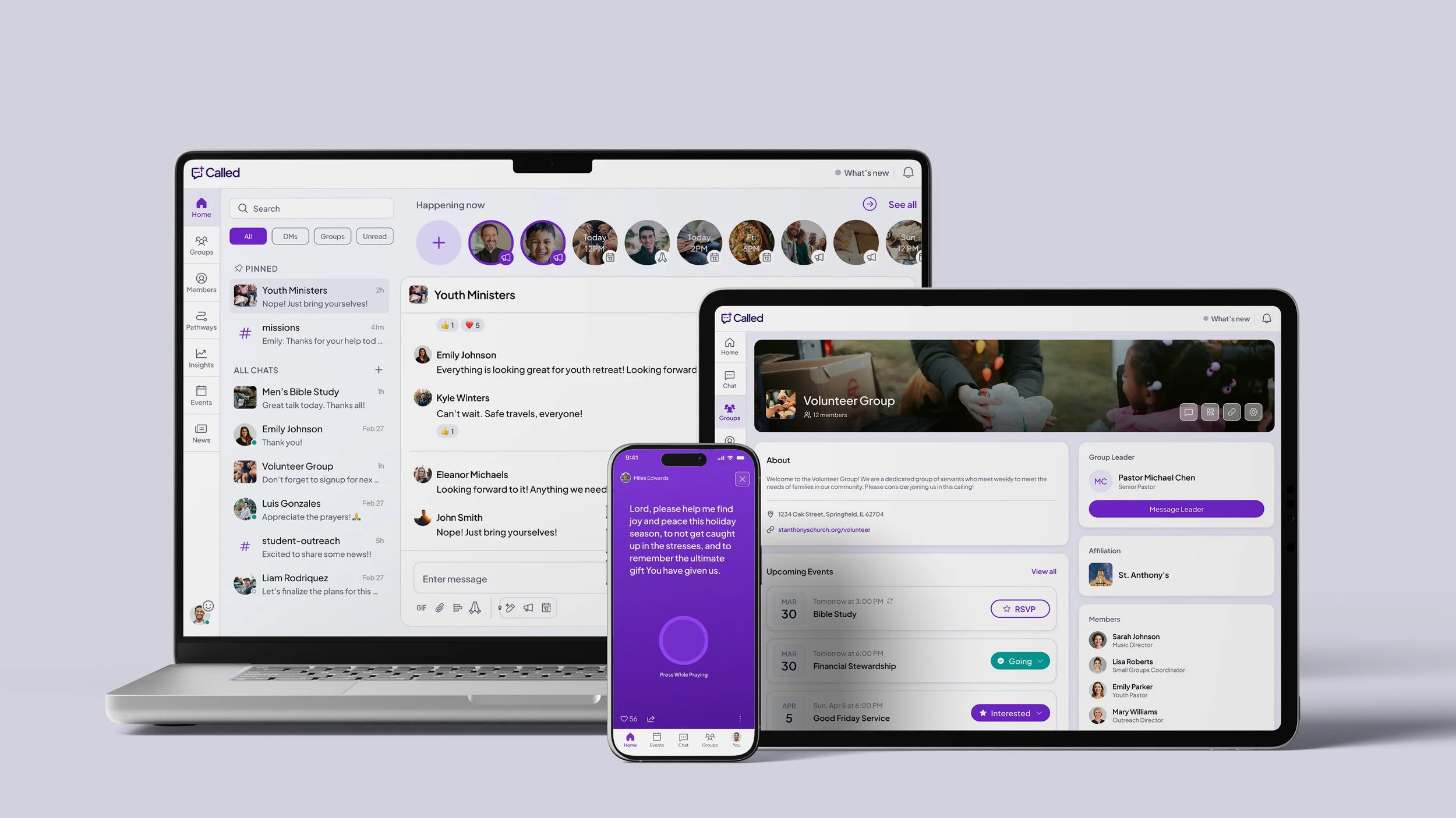
Ministry is relational, but most tools feel transactional. Called is different. It combines communication with community management, with features that help members feel needed and known.
-
Called is a communication and community management platform for Christian community leaders and their members. The primary user personas are: Church Leader/Church Member, Campus Minister/Student, and Group Leader/Group Member.
-
Brandon Livingood, Director of Product
Emmy Snipes, Product Designer
Jason Brown, Engineering Manager
Ben Musil, Frontend Engineer
Mike Bostone, Mobile Engineer
Nick Paul, Java Developer
Brian Manson, Backend Engineer
Peter DeVita, Backend Developer
-
As the sole product designer, I own the full product lifecycle: research, information architecture, design systems, onboarding, and feature design from discovery through production.
Impact

Monthly group join velocity more than doubled

Monthly group creation increased by 11%

Average group retention increased to 88.4%
One system, every screen
Immediately, I set out to improve an existing design system that wasn't built to scale. Components were scattered across multiple design files, and design tokens had only been loosely defined. Color values fell short of WCAG accessibility standards, particularly the dark mode variations. Consolidating and redefining those tokens was an early priority, ensuring contrast ratios, type scales, and spacing were compliant before being propagated across components. Without a unified foundation, patterns multiply, drift from engineering, and every release widens the gap between design and code.
Rethinking navigation
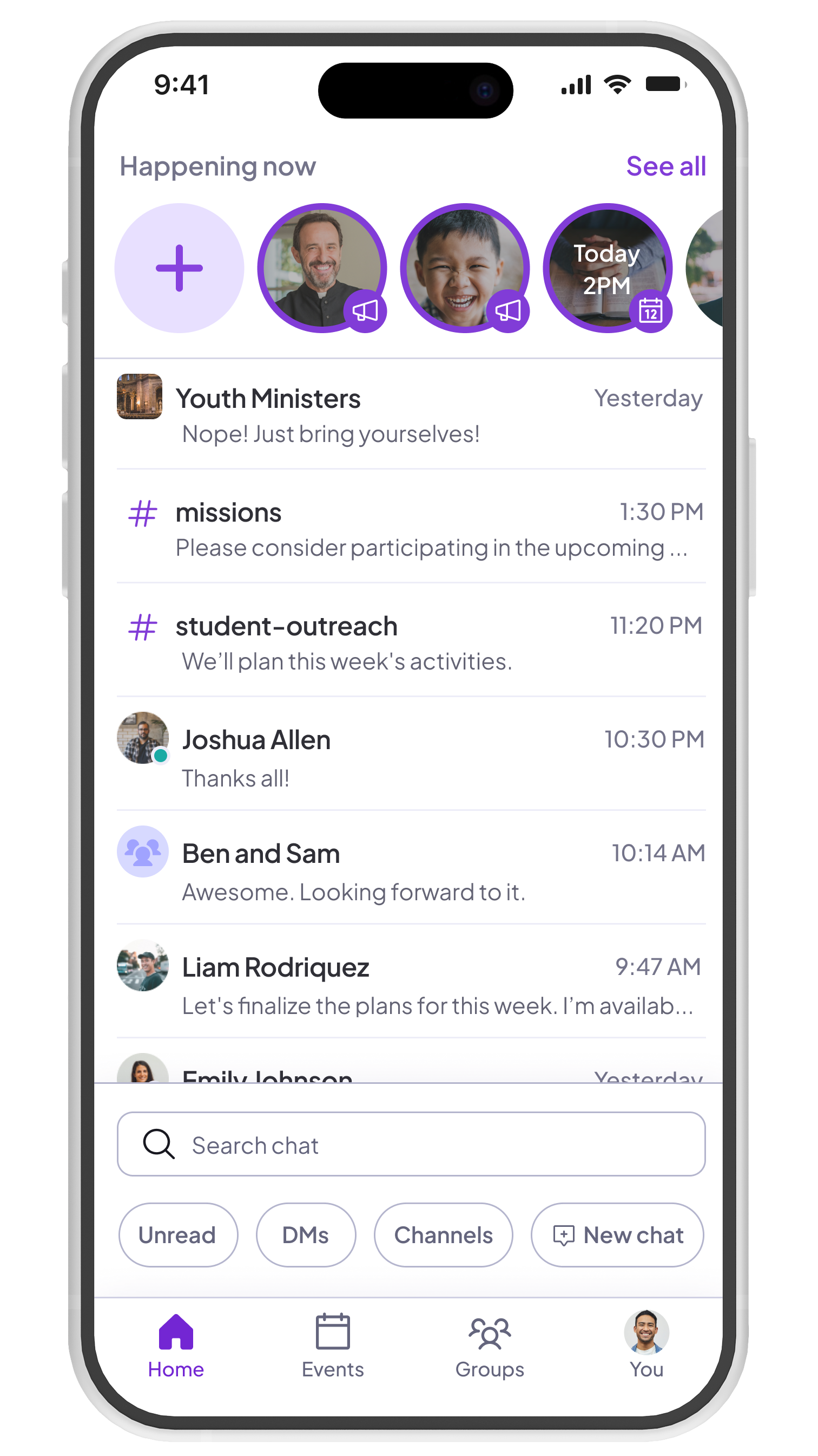
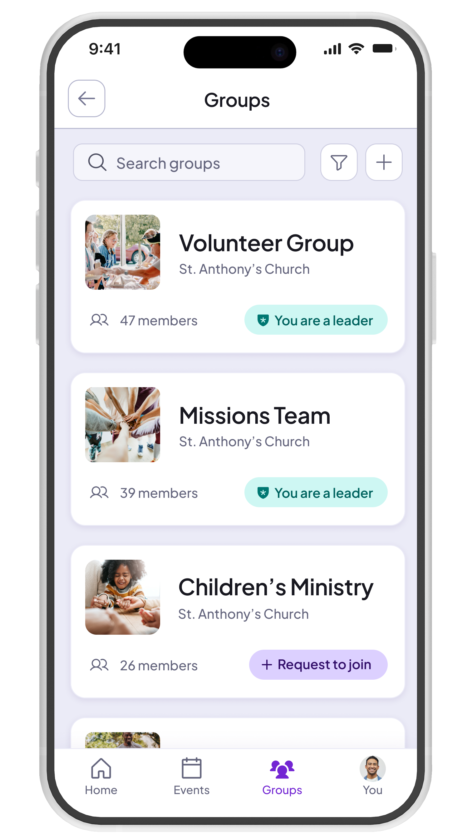
When I came onboard, the information architecture of Called did not align with the mental models of our users. Over 90% of users were only a part of one community and the community details screen received little visitation. and yet community details was actionable from the primary navigation menu. Groups was elevated to primary navigation so that users can reach group discovery in one click from any screen, collapsing a 3-step flow into a single step. Groups also became a global feature, allowing users to view groups from multiple communities at once.
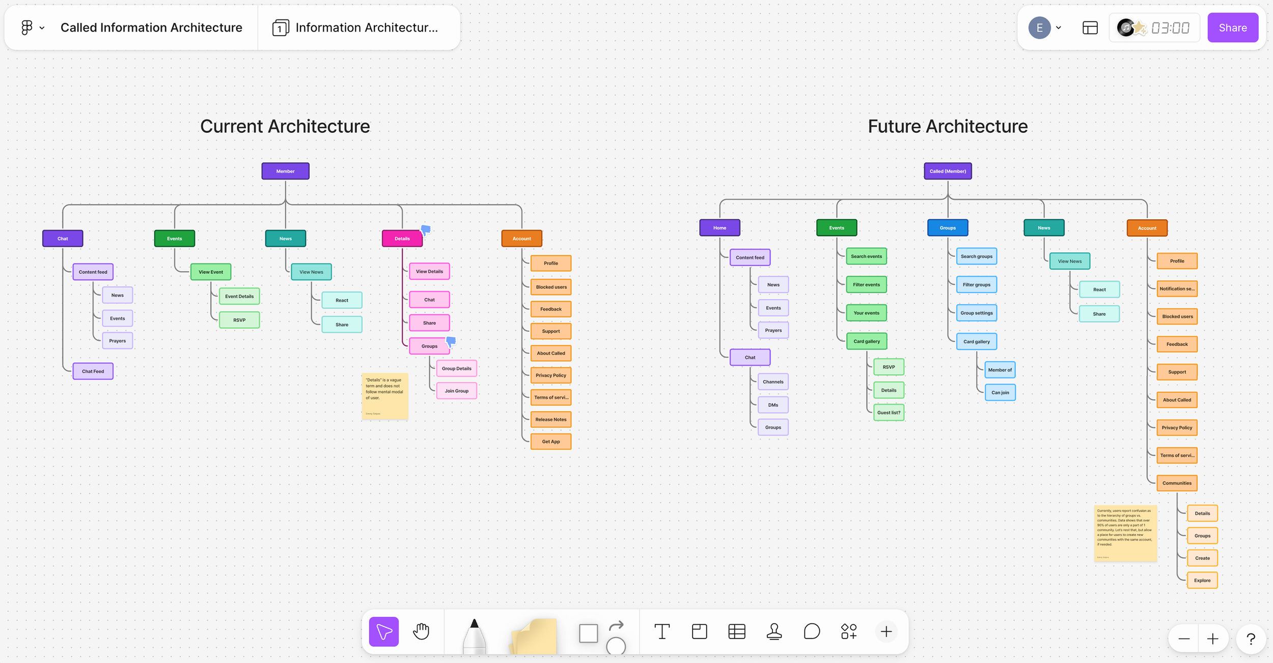
Navigation: Before & after
Driving adoption
The problem
Groups was one of the first features I turned my attention to after joining. It's a core part of the product, and small group participation is directly tied to member growth, yet adoption lagged significantly behind other features. Through research and usage data, it became clear that friction in the flow (not lack of interest) was the barrier. That made it a high-priority opportunity with a measurable path to impact.
Implemented solution
Groups was elevated to primary navigation, collapsing a three-step flow into a single click.
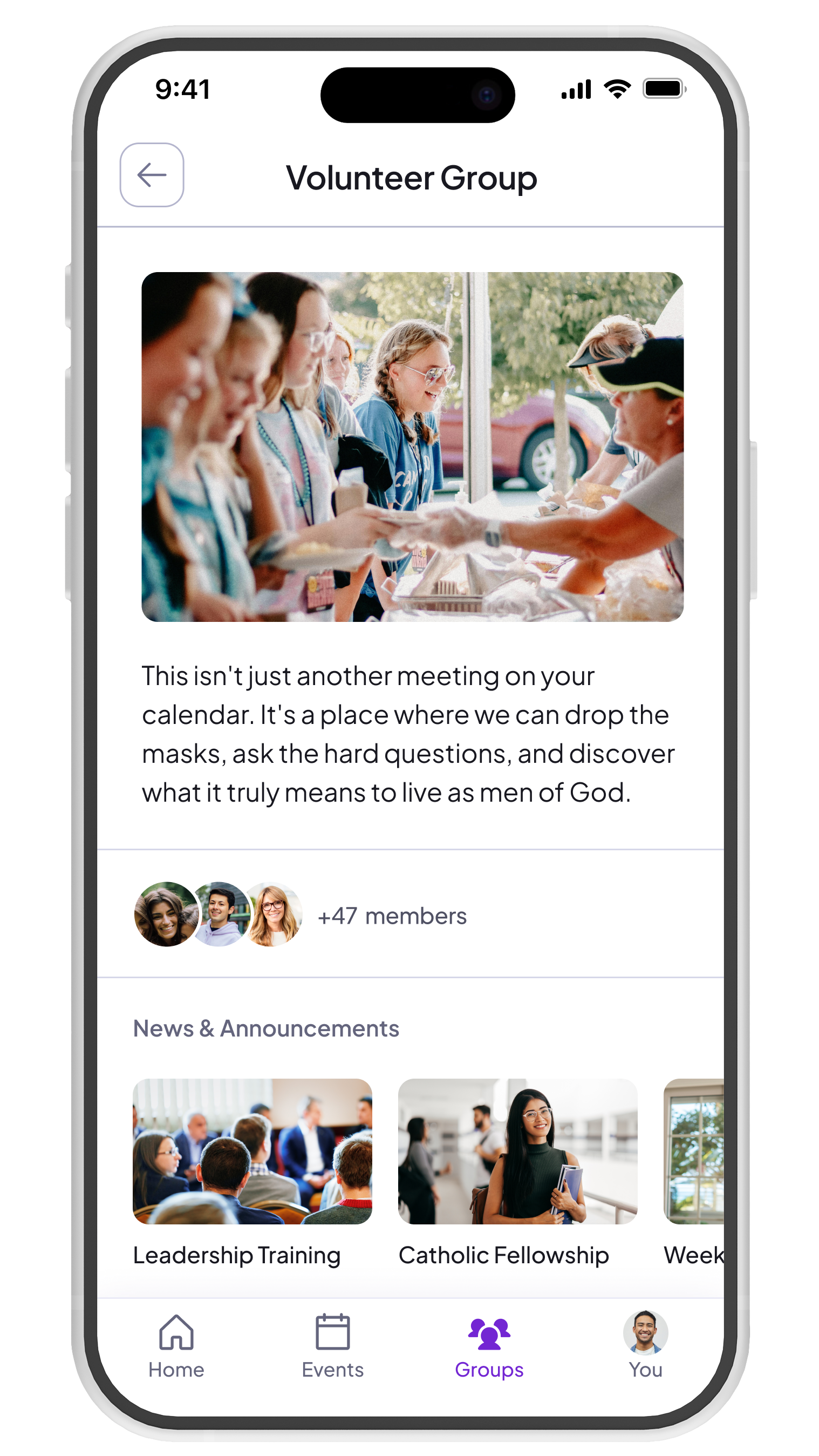
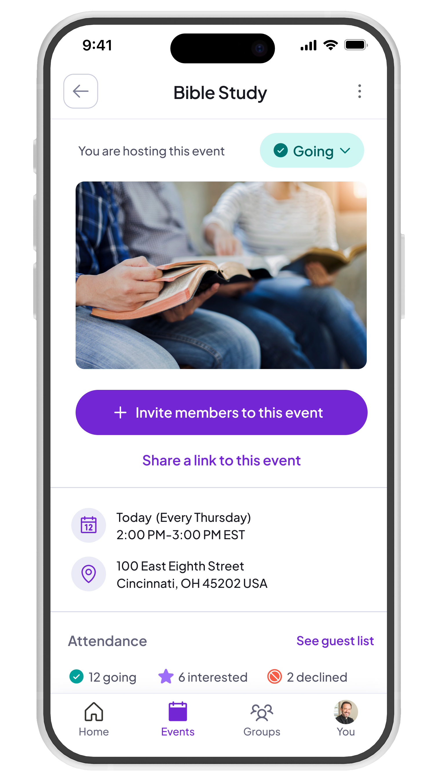
The screen was redesigned as a card gallery with search, sort, and filter controls, while separating "Your Groups" from community groups and adding color-coded status indicators and differentiated join signals to prevent users from unknowingly requesting access to a closed group.
User research
First, we conducted user interviews with power users to gain a better understanding of how they implemented groups in real life. Then, after understanding their mental model and jobs-to-be-done in regards to groups, we rapidly prototyped a new flow for group discovery. Then we ran user tests on an updated groups flow, covering navigation, group cards, and the group details screen.
Measurable results
Monthly group join velocity more than doubled within five months of launch, driven primarily by new users discovering groups rather than existing members joining more. Retention followed: users who found and joined groups stayed on the platform at a meaningfully higher rate, lifting retention 12.2 percentage points from 76.2% to 88.4%.

Leader controls
At Called, we have been proactive about maintaining an active relationship with our power users and collecting feedback from them. A primary theme in user feedback has been the ability (or lack-thereof) to manage group membership. For example, one campus minister told us that she created a Confirmation group. This allows her to easily share updates and help prepare students for that process. However, after those students have completed that process, she was unable to remove them from the group. The only workaround was to message them directly and ask that they remove themselves. This was a gap in core functionality, and led us to reconsider leader controls. To solve for this, we enabled leaders to add or remove members from groups, and also select default groups from within their community settings that all new community members would automatically be added to.